# Get both market and disposable Gini from SWIID
countries_for_comparison = EXTENDED_COUNTRIES
latest_year = 2020

gini_mkt = swiid.get_gini(countries_for_comparison, gini_type='mkt',
                           start_year=latest_year - 3, end_year=latest_year + 2)
gini_disp = swiid.get_gini(countries_for_comparison, gini_type='disp',
                            start_year=latest_year - 3, end_year=latest_year + 2)

# Take most recent year per country
if not gini_mkt.empty and not gini_disp.empty:
    latest_mkt = (gini_mkt.sort_values('year', ascending=False)
                  .groupby('country_code').first().reset_index())
    latest_disp = (gini_disp.sort_values('year', ascending=False)
                   .groupby('country_code').first().reset_index())

    merged = latest_mkt[['country_code', 'country_name', 'gini']].merge(
        latest_disp[['country_code', 'gini']],
        on='country_code', suffixes=('_mkt', '_disp')
    )
    merged = merged.dropna().sort_values('gini_disp')

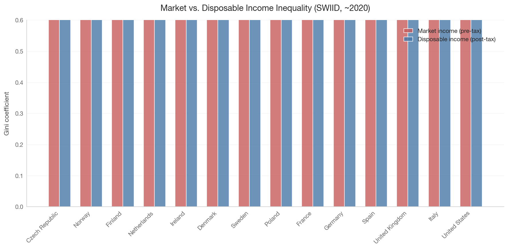
    # Grouped bar chart
    fig, ax = plt.subplots(figsize=(12, 6))
    x = np.arange(len(merged))
    width = 0.35

    bars_mkt = ax.bar(x - width/2, merged['gini_mkt'], width,
                       label='Market income (pre-tax)', color='#c75b5b', alpha=0.8)
    bars_disp = ax.bar(x + width/2, merged['gini_disp'], width,
                        label='Disposable income (post-tax)', color='#4878a8', alpha=0.8)

    ax.set_xticks(x)
    ax.set_xticklabels([country_name(c) for c in merged['country_code']],
                        rotation=45, ha='right')
    ax.set_ylabel('Gini coefficient')
    ax.set_title('Market vs. Disposable Income Inequality (SWIID, ~2020)', fontsize=14)
    ax.legend()
    ax.set_ylim(0, 0.6)

    # Add redistribution arrows for focus countries
    for i, row in merged.iterrows():
        idx = merged.index.get_loc(i)
        reduction = row['gini_mkt'] - row['gini_disp']
        ax.annotate(f'{reduction:.2f}',
                   xy=(idx, row['gini_disp'] + reduction/2),
                   fontsize=7, ha='center', color='#555', rotation=90)

    plt.tight_layout()
    save_figure(fig, '01_market_vs_disposable_gini')
    plt.show()
else:
    print("SWIID data not available for this query.")