Labor Force Participation and Working Hours

Notebook 09: Labor Force Participation and Working Hours

The previous notebooks examined income inequality (NB01-06), its relationship to well-being (NB07), and whether economic growth translates to happiness over time (NB08). This notebook turns to the labor market: how much do people actually work, and what does it buy them?

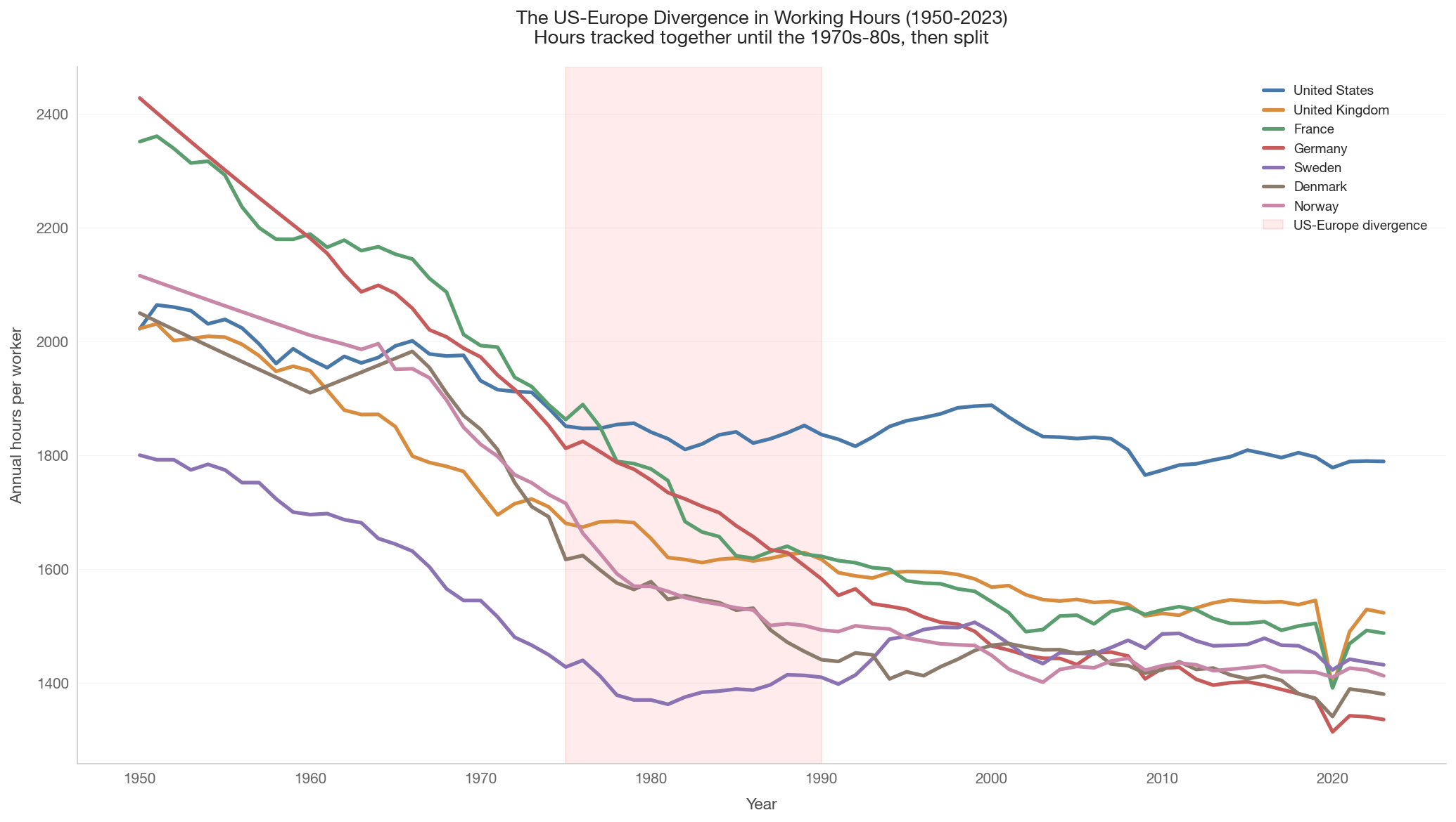
The data reveal a striking pattern among rich countries: Americans work substantially more hours per year than Europeans — roughly 200-400 more hours annually, equivalent to 5-10 extra 40-hour workweeks. Yet countries with shorter working hours often achieve comparable or higher productivity per hour. This raises fundamental questions about the relationship between work, output, and well-being.

Key questions

  1. How do working hours compare across countries today?
  2. How have working hours changed over 150 years of industrialization?
  3. How does labor force participation vary — especially the gender gap?
  4. Is there a relationship between working hours and productivity?
  5. Do people in countries with longer working hours report higher well-being?
  6. Is there a relationship between inequality and working hours?

Key literature

  • Alesina, Glaeser & Sacerdote (2005): “Work and Leisure in the US and Europe: Why So Different?” Labor market regulation and unionization explain much of the US-Europe gap.
  • Prescott (2004): Tax rates on labor income explain cross-country differences in hours worked.
  • Huberman & Minns (2007): Historical working hours data from 1870 onward, documenting the great decline in hours.
  • Pencavel (2015): The relationship between hours and output is nonlinear — beyond a threshold, more hours produce diminishing or even negative returns.

Data sources

Source Coverage Period
Our World in Data / PWT Working hours per worker, 185 countries 1950-2023
Huberman & Minns (via OWID) Historical working hours, ~15 countries 1870-1938
World Bank (ILO estimates) Labor force participation, all countries 1990-2024
Show code
import sys
sys.path.insert(0, '..')

import pandas as pd
import numpy as np
import matplotlib.pyplot as plt
import matplotlib.ticker as mtick
import seaborn as sns
from scipy import stats

from data.config import (
    FOCUS_COUNTRIES, WELLBEING_COUNTRIES, COUNTRY_NAMES, COUNTRY_COLORS,
    ISO2_TO_ISO3,
)
from data.plotting import (
    set_style, country_color, country_name, save_figure, annotate_countries,
)
from data import health_social, labor

set_style()

# Income tier classification (consistent with NB07/08)
INCOME_TIERS = {
    'High income': ['US', 'GB', 'FR', 'DE', 'SE', 'DK', 'NO', 'JP', 'AU', 'CL'],
    'Upper-middle': ['CN', 'BR', 'MX', 'ZA', 'TR', 'RU'],
    'Lower-middle': ['IN', 'ID', 'PH', 'EG', 'NG'],
    'Low income': ['ET', 'BD'],
}
TIER_COLORS = {
    'High income': '#4878a8',
    'Upper-middle': '#4a9a73',
    'Lower-middle': '#c06820',
    'Low income': '#b5403a',
}
COUNTRY_TIER = {}
for tier, codes in INCOME_TIERS.items():
    for c in codes:
        COUNTRY_TIER[c] = tier

def tier_color(code):
    return TIER_COLORS.get(COUNTRY_TIER.get(code, ''), '#999999')

1. Working Hours Across Countries Today

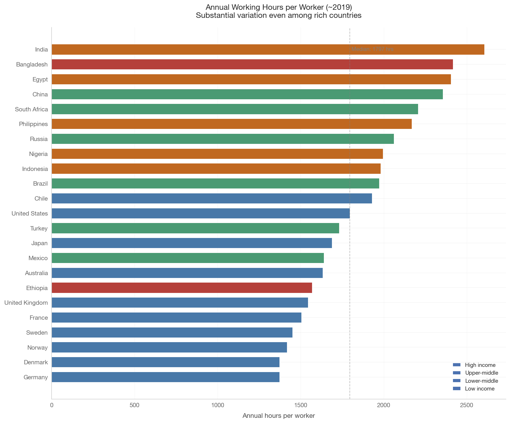
How many hours per year does the typical worker put in? The variation is enormous. In some countries, workers average over 2,000 hours per year; in others, under 1,400. The US consistently ranks among the longest-working rich countries.

Show code
# Load working hours snapshot (~2019)
hours_snap = labor.get_working_hours_snapshot(
    countries=WELLBEING_COUNTRIES, year=2019)

if not hours_snap.empty:
    # Sort by hours descending
    hours_snap = hours_snap.sort_values('hours_per_worker', ascending=True)
    hours_snap['country'] = hours_snap['country_code'].map(
        lambda c: country_name(c))
    colors = [tier_color(c) for c in hours_snap['country_code']]

    fig, ax = plt.subplots(figsize=(12, 10))
    bars = ax.barh(range(len(hours_snap)), hours_snap['hours_per_worker'],
                   color=colors, edgecolor='white', linewidth=0.5, height=0.7)
    ax.set_yticks(range(len(hours_snap)))
    ax.set_yticklabels(hours_snap['country'])
    ax.set_xlabel('Annual hours per worker')
    ax.set_title('Annual Working Hours per Worker (~2019)\n'
                 'Substantial variation even among rich countries',
                 fontsize=13)

    # Median reference line
    median_hrs = hours_snap['hours_per_worker'].median()
    ax.axvline(median_hrs, color='gray', linestyle='--', alpha=0.5,
               linewidth=1)
    ax.text(median_hrs + 10, len(hours_snap) - 1,
            f'Median: {median_hrs:.0f} hrs',
            va='center', fontsize=9, color='gray')

    for tier, color in TIER_COLORS.items():
        ax.barh([], [], color=color, label=tier)
    ax.legend(loc='lower right', fontsize=9)

    ax.grid(axis='x', alpha=0.3)
    plt.tight_layout()
    save_figure(fig, '09_working_hours_bar_chart')
    plt.show()

    # Key statistics
    us_hrs = hours_snap[hours_snap['country_code'] == 'US']['hours_per_worker'].values
    de_hrs = hours_snap[hours_snap['country_code'] == 'DE']['hours_per_worker'].values
    dk_hrs = hours_snap[hours_snap['country_code'] == 'DK']['hours_per_worker'].values

    if len(us_hrs) > 0 and len(de_hrs) > 0:
        gap = us_hrs[0] - de_hrs[0]
        print(f'US: {us_hrs[0]:.0f} hours/year')
        print(f'Germany: {de_hrs[0]:.0f} hours/year')
        print(f'Gap: {gap:.0f} hours = ~{gap/40:.0f} extra 40-hour workweeks')
    if len(dk_hrs) > 0 and len(us_hrs) > 0:
        gap_dk = us_hrs[0] - dk_hrs[0]
        print(f'Denmark: {dk_hrs[0]:.0f} hours/year')
        print(f'US-Denmark gap: {gap_dk:.0f} hours = ~{gap_dk/40:.0f} extra workweeks')
    print(f'\nRange: {hours_snap["hours_per_worker"].min():.0f} to '
          f'{hours_snap["hours_per_worker"].max():.0f} hours/year')
else:
    print('Working hours data not available.')

US: 1797 hours/year
Germany: 1372 hours/year
Gap: 425 hours = ~11 extra 40-hour workweeks
Denmark: 1372 hours/year
US-Denmark gap: 424 hours = ~11 extra workweeks

Range: 1372 to 2605 hours/year
Show code
if not hours_snap.empty:
    # Load GDP data
    wb_data = health_social.get_wellbeing_data(year=2019)

    if not wb_data.empty:
        merged = hours_snap.merge(
            wb_data[['country_code', 'gdp_per_capita_ppp']],
            on='country_code', how='inner')
        merged = merged.dropna(subset=['gdp_per_capita_ppp',
                                        'hours_per_worker'])

        fig, ax = plt.subplots(figsize=(12, 8))
        colors = [tier_color(c) for c in merged['country_code']]
        ax.scatter(merged['gdp_per_capita_ppp'], merged['hours_per_worker'],
                   c=colors, s=120, zorder=5, edgecolors='white',
                   linewidth=1, alpha=0.85)

        # Log fit
        x = np.log(merged['gdp_per_capita_ppp'].values)
        y = merged['hours_per_worker'].values
        mask = np.isfinite(x) & np.isfinite(y)
        if mask.sum() > 3:
            slope, intercept, r, p, se = stats.linregress(x[mask], y[mask])
            x_fit = np.linspace(x[mask].min(), x[mask].max(), 200)
            ax.plot(np.exp(x_fit), intercept + slope * x_fit,
                    color='gray', linestyle='--', linewidth=2, alpha=0.6)
            ax.text(0.05, 0.95,
                    f'r = {r:.3f}, p = {p:.3f}\n'
                    f'Richer countries tend to work fewer hours',
                    transform=ax.transAxes, fontsize=10, va='top',
                    bbox=dict(boxstyle='round', facecolor='white',
                              alpha=0.8))
            print(f'Correlation (log GDP vs hours): r = {r:.3f}, p = {p:.4f}')

        annotate_countries(ax, merged['gdp_per_capita_ppp'].values,
                           merged['hours_per_worker'].values,
                           merged['country_code'].values)

        ax.set_xscale('log')
        ax.xaxis.set_major_formatter(mtick.FuncFormatter(
            lambda x, _: f'${x/1000:.0f}k'))
        ax.set_xlabel('GDP per capita, PPP (log scale)')
        ax.set_ylabel('Annual hours per worker')
        ax.set_title('Richer Countries Work Fewer Hours (~2019)\n'
                     'The negative gradient: income buys leisure',
                     fontsize=13)

        for tier, color in TIER_COLORS.items():
            ax.scatter([], [], c=color, s=80, label=tier)
        ax.legend(loc='upper right', fontsize=9)

        plt.tight_layout()
        save_figure(fig, '09_working_hours_vs_gdp')
        plt.show()
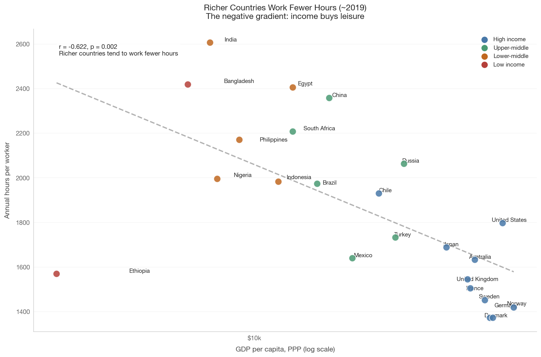
Correlation (log GDP vs hours): r = -0.622, p = 0.0015


2. The Long Decline: Working Hours Over 150 Years

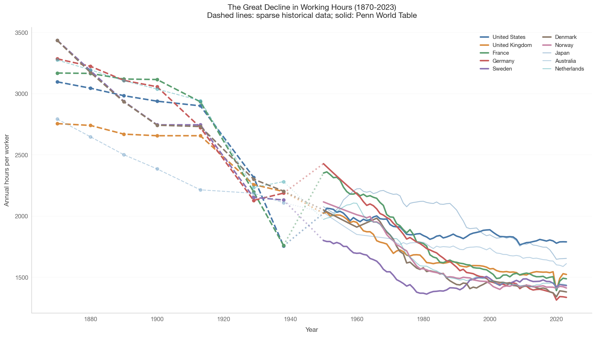
One of the great achievements of economic development is the dramatic reduction in working hours. In 1870, workers in industrialized countries averaged 2,500-3,000+ hours per year — roughly 60-70 hours per week, 50 weeks per year. Today, the range is 1,300-1,800 in most rich countries.

This section uses historical data from Huberman & Minns (2007), extended forward with Penn World Table data, both sourced via Our World in Data.

Show code
# Load full historical time series
historical_countries = list(dict.fromkeys(
    FOCUS_COUNTRIES + ['JP', 'AU', 'NL']))

hours_hist = labor.get_working_hours_historical(
    countries=historical_countries, start_year=1870, end_year=2023)

if not hours_hist.empty:
    fig, ax = plt.subplots(figsize=(14, 8))

    for cc in historical_countries:
        cdf = hours_hist[hours_hist['country_code'] == cc].sort_values('year')
        if cdf.empty:
            continue

        # Split into pre-1950 (sparse) and post-1950 (continuous)
        pre = cdf[cdf['year'] < 1950]
        post = cdf[cdf['year'] >= 1950]

        color = country_color(cc)
        lw = 2.5 if cc in FOCUS_COUNTRIES else 1.5
        alpha = 1.0 if cc in FOCUS_COUNTRIES else 0.5

        # Pre-1950: markers with dashed line
        if not pre.empty:
            ax.plot(pre['year'], pre['hours_per_worker'],
                    color=color, linewidth=lw, linestyle='--',
                    marker='o', markersize=5, alpha=alpha)

        # Post-1950: solid line
        if not post.empty:
            ax.plot(post['year'], post['hours_per_worker'],
                    color=color, linewidth=lw, alpha=alpha,
                    label=country_name(cc))

        # Connect pre and post
        if not pre.empty and not post.empty:
            bridge = pd.concat([pre.iloc[[-1]], post.iloc[[0]]])
            ax.plot(bridge['year'], bridge['hours_per_worker'],
                    color=color, linewidth=lw, linestyle=':', alpha=alpha*0.5)

    ax.set_xlabel('Year')
    ax.set_ylabel('Annual hours per worker')
    ax.set_title('The Great Decline in Working Hours (1870-2023)\n'
                 'Dashed lines: sparse historical data; solid: Penn World Table',
                 fontsize=13)
    ax.legend(loc='upper right', fontsize=9, ncol=2)
    ax.grid(axis='y', alpha=0.3)

    plt.tight_layout()
    save_figure(fig, '09_working_hours_historical')
    plt.show()

    # Report percentage decline for countries with 1870 data
    print('Decline in annual hours (countries with 1870 data):')
    for cc in historical_countries:
        cdf = hours_hist[hours_hist['country_code'] == cc].sort_values('year')
        early = cdf[cdf['year'] <= 1880]
        late = cdf[cdf['year'] >= 2018]
        if not early.empty and not late.empty:
            h1 = early.iloc[0]['hours_per_worker']
            h2 = late.iloc[-1]['hours_per_worker']
            pct = (h2 - h1) / h1 * 100
            print(f'  {country_name(cc)}: {h1:.0f} -> {h2:.0f} '
                  f'({pct:+.0f}%)')
else:
    print('Historical working hours data not available.')

Decline in annual hours (countries with 1870 data):
  United States: 3096 -> 1789 (-42%)
  United Kingdom: 2755 -> 1523 (-45%)
  France: 3168 -> 1487 (-53%)
  Germany: 3284 -> 1335 (-59%)
  Sweden: 3436 -> 1432 (-58%)
  Denmark: 3434 -> 1380 (-60%)
  Australia: 2792 -> 1611 (-42%)
  Netherlands: 3274 -> 1439 (-56%)
Show code
if not hours_hist.empty:
    fig, ax = plt.subplots(figsize=(14, 8))

    post1950 = hours_hist[hours_hist['year'] >= 1950]

    for cc in FOCUS_COUNTRIES:
        cdf = post1950[post1950['country_code'] == cc].sort_values('year')
        if not cdf.empty:
            ax.plot(cdf['year'], cdf['hours_per_worker'],
                    color=country_color(cc), linewidth=2.5,
                    label=country_name(cc))

    # Shade the divergence period
    ax.axvspan(1975, 1990, alpha=0.08, color='red',
               label='US-Europe divergence')

    ax.set_xlabel('Year')
    ax.set_ylabel('Annual hours per worker')
    ax.set_title('The US-Europe Divergence in Working Hours (1950-2023)\n'
                 'Hours tracked together until the 1970s-80s, then split',
                 fontsize=13)
    ax.legend(loc='upper right', fontsize=9)
    ax.grid(axis='y', alpha=0.3)

    plt.tight_layout()
    save_figure(fig, '09_working_hours_convergence_divergence')
    plt.show()

    # Report 1979 vs latest for focus countries
    print('\nWorking hours: ~1979 vs most recent')
    for cc in FOCUS_COUNTRIES:
        cdf = post1950[post1950['country_code'] == cc].sort_values('year')
        h1979 = cdf[cdf['year'].between(1978, 1981)]
        h2019 = cdf[cdf['year'] >= 2018]
        if not h1979.empty and not h2019.empty:
            v1 = h1979.iloc[0]['hours_per_worker']
            v2 = h2019.iloc[-1]['hours_per_worker']
            chg = v2 - v1
            print(f'  {country_name(cc)}: {v1:.0f} -> {v2:.0f} ({chg:+.0f} hours)')
else:
    print('Data not available for convergence plot.')


Working hours: ~1979 vs most recent
  United States: 1854 -> 1789 (-65 hours)
  United Kingdom: 1684 -> 1523 (-161 hours)
  France: 1789 -> 1487 (-302 hours)
  Germany: 1787 -> 1335 (-452 hours)
  Sweden: 1378 -> 1432 (+53 hours)
  Denmark: 1575 -> 1380 (-195 hours)
  Norway: 1592 -> 1412 (-179 hours)

3. Labor Force Participation Across Countries

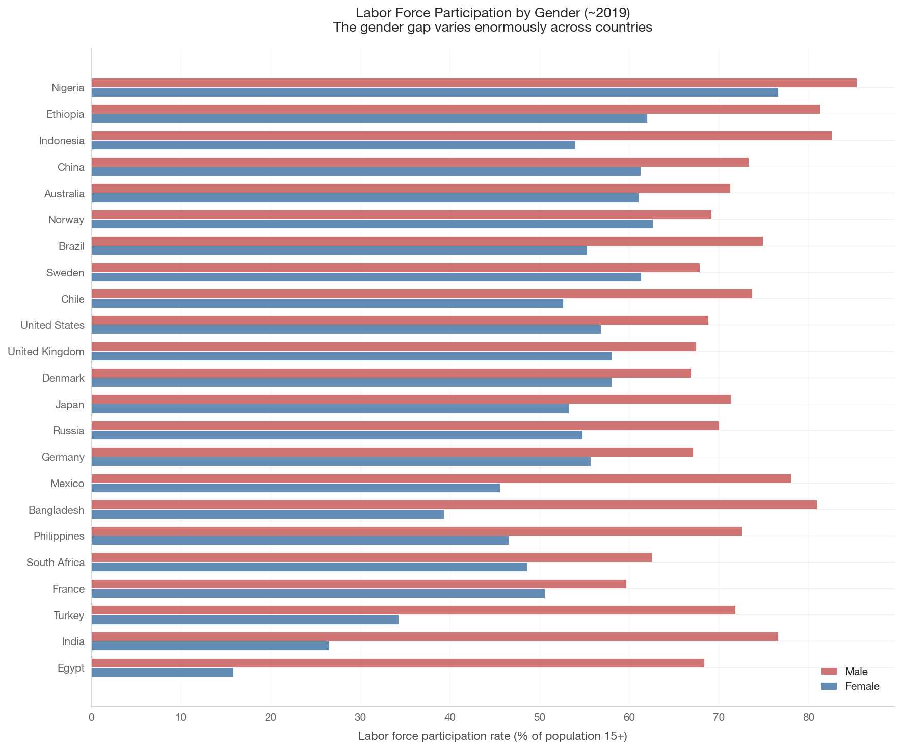
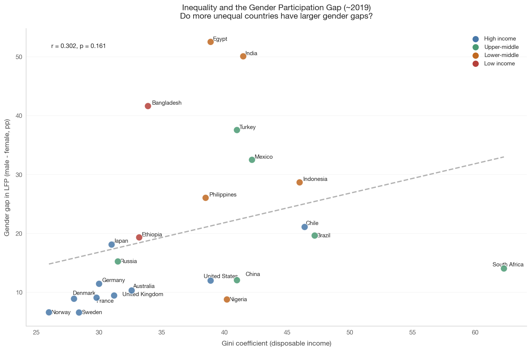
Labor force participation (LFP) measures the share of the working-age population (ages 15+) that is either employed or actively seeking work. It varies substantially across countries, shaped by retirement policies, female participation norms, youth education enrollment, and cultural factors.

The gender gap in LFP is one of the most important dimensions of labor market inequality.

Show code
lfp_snap = labor.get_labor_force_participation_snapshot(
    countries=WELLBEING_COUNTRIES, year=2019)

if not lfp_snap.empty and 'lfp_male' in lfp_snap.columns:
    # Sort by total LFP
    lfp_snap = lfp_snap.sort_values('lfp_total', ascending=True)
    countries_ordered = lfp_snap['country_code'].values
    y_pos = np.arange(len(lfp_snap))
    bar_height = 0.35

    fig, ax = plt.subplots(figsize=(12, 10))

    ax.barh(y_pos + bar_height/2, lfp_snap['lfp_male'],
            height=bar_height, color='#c75b5b', alpha=0.85,
            label='Male', edgecolor='white', linewidth=0.5)
    ax.barh(y_pos - bar_height/2, lfp_snap['lfp_female'],
            height=bar_height, color='#4878a8', alpha=0.85,
            label='Female', edgecolor='white', linewidth=0.5)

    ax.set_yticks(y_pos)
    ax.set_yticklabels([country_name(c) for c in countries_ordered])
    ax.set_xlabel('Labor force participation rate (% of population 15+)')
    ax.set_title('Labor Force Participation by Gender (~2019)\n'
                 'The gender gap varies enormously across countries',
                 fontsize=13)
    ax.legend(loc='lower right', fontsize=10)
    ax.grid(axis='x', alpha=0.3)

    plt.tight_layout()
    save_figure(fig, '09_lfp_bar_chart')
    plt.show()

    # Key statistics
    print(f'Largest gender gap: '
          f'{country_name(lfp_snap.loc[lfp_snap["gender_gap"].idxmax(), "country_code"])} '
          f'({lfp_snap["gender_gap"].max():.1f} pp)')
    print(f'Smallest gender gap: '
          f'{country_name(lfp_snap.loc[lfp_snap["gender_gap"].idxmin(), "country_code"])} '
          f'({lfp_snap["gender_gap"].min():.1f} pp)')
    print(f'Highest female LFP: '
          f'{country_name(lfp_snap.loc[lfp_snap["lfp_female"].idxmax(), "country_code"])} '
          f'({lfp_snap["lfp_female"].max():.1f}%)')
    print(f'Lowest female LFP: '
          f'{country_name(lfp_snap.loc[lfp_snap["lfp_female"].idxmin(), "country_code"])} '
          f'({lfp_snap["lfp_female"].min():.1f}%)')
else:
    print('LFP data not available.')

Largest gender gap: Egypt (52.5 pp)
Smallest gender gap: Sweden (6.5 pp)
Highest female LFP: Nigeria (76.6%)
Lowest female LFP: Egypt (15.9%)

4. The Gender Gap Over Time

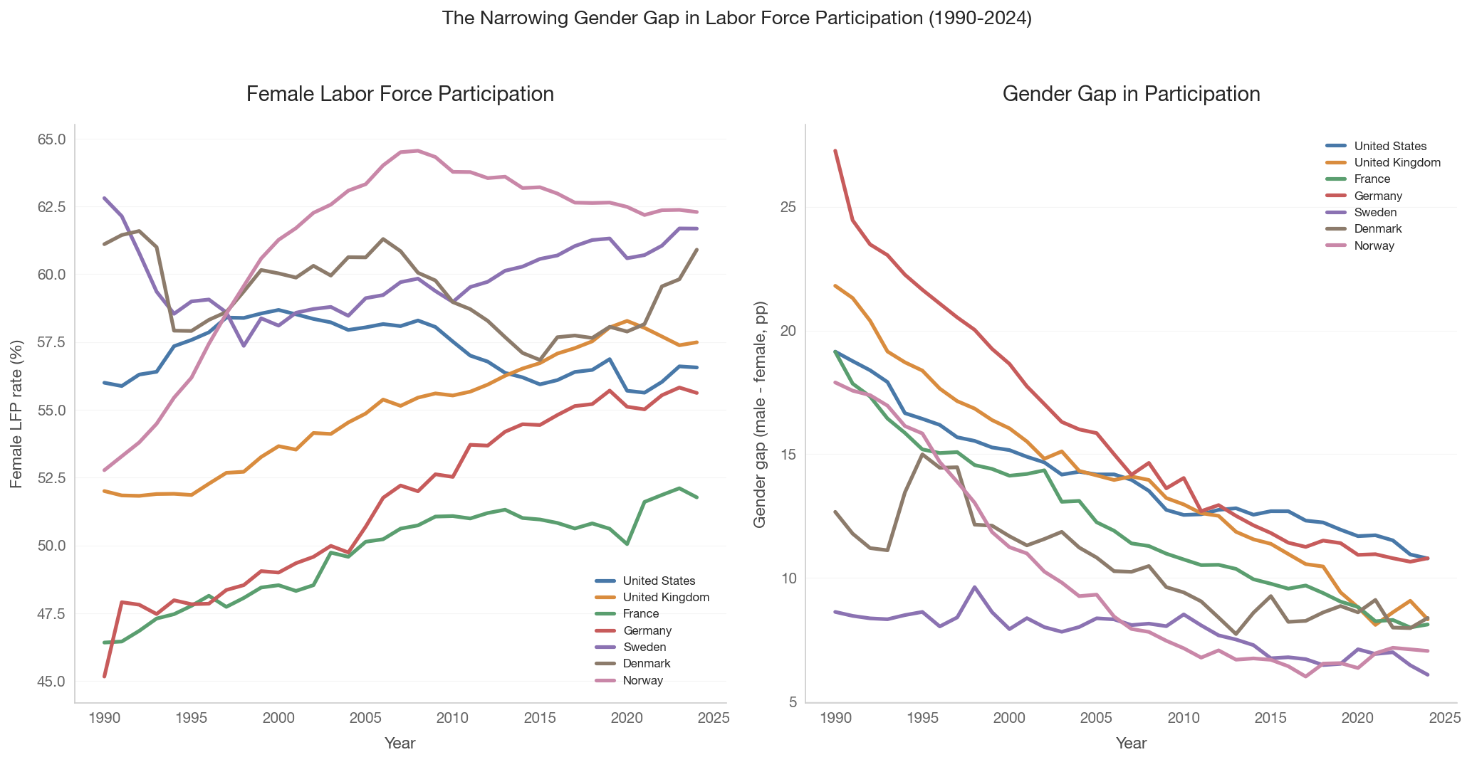
The gender gap in labor force participation has narrowed in most rich countries since 1990, but the pace varies enormously. Nordic countries achieved near-parity decades ago; other countries still have gaps of 20-40 percentage points.

Show code
# Load female and male LFP time series
lfp_female_ts = labor.get_labor_force_participation_timeseries(
    countries=FOCUS_COUNTRIES, start_year=1990, end_year=2024, gender='female')
lfp_male_ts = labor.get_labor_force_participation_timeseries(
    countries=FOCUS_COUNTRIES, start_year=1990, end_year=2024, gender='male')

if not lfp_female_ts.empty and not lfp_male_ts.empty:
    # Compute gender gap
    gap_ts = lfp_male_ts.merge(lfp_female_ts, on=['country_code', 'year'],
                                suffixes=('_male', '_female'))
    gap_ts['gender_gap'] = gap_ts['lfp_rate_male'] - gap_ts['lfp_rate_female']

    fig, axes = plt.subplots(1, 2, figsize=(14, 7))

    # Left: Female LFP over time
    ax = axes[0]
    for cc in FOCUS_COUNTRIES:
        cdf = lfp_female_ts[lfp_female_ts['country_code'] == cc].sort_values('year')
        if not cdf.empty:
            ax.plot(cdf['year'], cdf['lfp_rate'],
                    color=country_color(cc), linewidth=2.5,
                    label=country_name(cc))
    ax.set_xlabel('Year')
    ax.set_ylabel('Female LFP rate (%)')
    ax.set_title('Female Labor Force Participation')
    ax.legend(loc='best', fontsize=8)
    ax.grid(axis='y', alpha=0.3)

    # Right: Gender gap over time
    ax = axes[1]
    for cc in FOCUS_COUNTRIES:
        cdf = gap_ts[gap_ts['country_code'] == cc].sort_values('year')
        if not cdf.empty:
            ax.plot(cdf['year'], cdf['gender_gap'],
                    color=country_color(cc), linewidth=2.5,
                    label=country_name(cc))
    ax.set_xlabel('Year')
    ax.set_ylabel('Gender gap (male - female, pp)')
    ax.set_title('Gender Gap in Participation')
    ax.legend(loc='best', fontsize=8)
    ax.grid(axis='y', alpha=0.3)

    fig.suptitle('The Narrowing Gender Gap in Labor Force Participation (1990-2024)',
                 fontsize=13, y=1.02)
    plt.tight_layout()
    save_figure(fig, '09_lfp_gender_gap_timeseries')
    plt.show()

    # Report gap change
    print('Gender gap (male - female LFP, pp): 1990 vs latest')
    for cc in FOCUS_COUNTRIES:
        cdf = gap_ts[gap_ts['country_code'] == cc].sort_values('year')
        if len(cdf) >= 2:
            g1 = cdf.iloc[0]['gender_gap']
            g2 = cdf.iloc[-1]['gender_gap']
            print(f'  {country_name(cc)}: {g1:.1f} -> {g2:.1f} '
                  f'(narrowed by {g1-g2:.1f} pp)')
else:
    print('LFP time series data not available.')

Gender gap (male - female LFP, pp): 1990 vs latest
  United States: 19.1 -> 10.8 (narrowed by 8.4 pp)
  United Kingdom: 21.8 -> 8.3 (narrowed by 13.5 pp)
  France: 19.1 -> 8.1 (narrowed by 11.0 pp)
  Germany: 27.3 -> 10.8 (narrowed by 16.5 pp)
  Sweden: 8.6 -> 6.1 (narrowed by 2.5 pp)
  Denmark: 12.7 -> 8.4 (narrowed by 4.3 pp)
  Norway: 17.9 -> 7.1 (narrowed by 10.8 pp)
Show code
if not lfp_snap.empty and 'gender_gap' in lfp_snap.columns:
    wb_data = health_social.get_wellbeing_data(year=2019)
    if not wb_data.empty and 'gini_disp' in wb_data.columns:
        merged = lfp_snap.merge(
            wb_data[['country_code', 'gini_disp']],
            on='country_code', how='inner')
        merged = merged.dropna(subset=['gini_disp', 'gender_gap'])

        if len(merged) >= 5:
            fig, ax = plt.subplots(figsize=(12, 8))
            colors = [tier_color(c) for c in merged['country_code']]
            ax.scatter(merged['gini_disp'], merged['gender_gap'],
                       c=colors, s=120, zorder=5, edgecolors='white',
                       linewidth=1, alpha=0.85)

            x = merged['gini_disp'].values
            y = merged['gender_gap'].values
            mask = np.isfinite(x) & np.isfinite(y)
            if mask.sum() > 3:
                sl, it, r, p, se = stats.linregress(x[mask], y[mask])
                xf = np.linspace(x[mask].min(), x[mask].max(), 100)
                ax.plot(xf, it + sl * xf, color='gray', linestyle='--',
                        linewidth=2, alpha=0.6)
                ax.text(0.05, 0.95,
                        f'r = {r:.3f}, p = {p:.3f}',
                        transform=ax.transAxes, fontsize=10, va='top',
                        bbox=dict(boxstyle='round', facecolor='white',
                                  alpha=0.8))
                print(f'Correlation (Gini vs gender gap): r = {r:.3f}, p = {p:.4f}')

            annotate_countries(ax, merged['gini_disp'].values,
                               merged['gender_gap'].values,
                               merged['country_code'].values)

            ax.set_xlabel('Gini coefficient (disposable income)')
            ax.set_ylabel('Gender gap in LFP (male - female, pp)')
            ax.set_title('Inequality and the Gender Participation Gap (~2019)\n'
                         'Do more unequal countries have larger gender gaps?',
                         fontsize=13)

            for tier, color in TIER_COLORS.items():
                ax.scatter([], [], c=color, s=80, label=tier)
            ax.legend(loc='best', fontsize=9)

            plt.tight_layout()
            save_figure(fig, '09_lfp_gender_gap_vs_gini')
            plt.show()
        else:
            print(f'Only {len(merged)} countries with both Gini and LFP data.')
    else:
        print('Gini data not available.')
else:
    print('LFP snapshot not available for gender gap vs Gini.')
Correlation (Gini vs gender gap): r = 0.302, p = 0.1607


5. Working Hours and Productivity

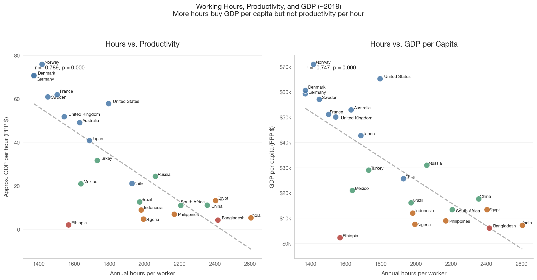
A common assumption: more hours = more output. But the relationship between hours and productivity (GDP per hour worked) is more complex. Countries with shorter hours often achieve higher output per hour. Pencavel (2015) found that beyond ~48 hours per week, additional hours produce diminishing or even negative marginal returns.

The US works substantially more hours than Germany or France but does not achieve proportionally more GDP per hour. The extra hours buy GDP per capita, but at the cost of leisure.

Show code
if not hours_snap.empty:
    wb_data = health_social.get_wellbeing_data(year=2019)
    lfp_data = labor.get_labor_force_participation_snapshot(
        countries=WELLBEING_COUNTRIES, year=2019)

    if not wb_data.empty and not lfp_data.empty:
        # Merge all three
        prod = (hours_snap
                .merge(wb_data[['country_code', 'gdp_per_capita_ppp']],
                       on='country_code', how='inner')
                .merge(lfp_data[['country_code', 'lfp_total']],
                       on='country_code', how='inner'))
        prod = prod.dropna()

        # Approximate GDP per hour
        prod['gdp_per_hour'] = (prod['gdp_per_capita_ppp']
                                 / (prod['lfp_total'] / 100
                                    * prod['hours_per_worker']))

        fig, axes = plt.subplots(1, 2, figsize=(14, 7))

        # Panel 1: Hours vs GDP per hour (productivity)
        ax = axes[0]
        colors = [tier_color(c) for c in prod['country_code']]
        ax.scatter(prod['hours_per_worker'], prod['gdp_per_hour'],
                   c=colors, s=120, zorder=5, edgecolors='white',
                   linewidth=1, alpha=0.85)

        x = prod['hours_per_worker'].values
        y = prod['gdp_per_hour'].values
        mask = np.isfinite(x) & np.isfinite(y)
        if mask.sum() > 3:
            sl, it, r, p, _ = stats.linregress(x[mask], y[mask])
            xf = np.linspace(x[mask].min(), x[mask].max(), 100)
            ax.plot(xf, it + sl * xf, color='gray', linestyle='--',
                    linewidth=2, alpha=0.6)
            ax.text(0.05, 0.95, f'r = {r:.3f}, p = {p:.3f}',
                    transform=ax.transAxes, fontsize=10, va='top',
                    bbox=dict(boxstyle='round', facecolor='white', alpha=0.8))

        annotate_countries(ax, prod['hours_per_worker'].values,
                           prod['gdp_per_hour'].values,
                           prod['country_code'].values, fontsize=8)
        ax.set_xlabel('Annual hours per worker')
        ax.set_ylabel('Approx. GDP per hour (PPP $)')
        ax.set_title('Hours vs. Productivity')

        # Panel 2: Hours vs GDP per capita
        ax = axes[1]
        ax.scatter(prod['hours_per_worker'], prod['gdp_per_capita_ppp'],
                   c=colors, s=120, zorder=5, edgecolors='white',
                   linewidth=1, alpha=0.85)

        y2 = prod['gdp_per_capita_ppp'].values
        if mask.sum() > 3:
            sl2, it2, r2, p2, _ = stats.linregress(x[mask], y2[mask])
            xf = np.linspace(x[mask].min(), x[mask].max(), 100)
            ax.plot(xf, it2 + sl2 * xf, color='gray', linestyle='--',
                    linewidth=2, alpha=0.6)
            ax.text(0.05, 0.95, f'r = {r2:.3f}, p = {p2:.3f}',
                    transform=ax.transAxes, fontsize=10, va='top',
                    bbox=dict(boxstyle='round', facecolor='white', alpha=0.8))

        annotate_countries(ax, prod['hours_per_worker'].values,
                           prod['gdp_per_capita_ppp'].values,
                           prod['country_code'].values, fontsize=8)
        ax.set_xlabel('Annual hours per worker')
        ax.set_ylabel('GDP per capita (PPP $)')
        ax.yaxis.set_major_formatter(mtick.FuncFormatter(
            lambda x, _: f'${x/1000:.0f}k'))
        ax.set_title('Hours vs. GDP per Capita')

        fig.suptitle('Working Hours, Productivity, and GDP (~2019)\n'
                     'More hours buy GDP per capita but not productivity per hour',
                     fontsize=13, y=1.03)
        plt.tight_layout()
        save_figure(fig, '09_hours_vs_productivity')
        plt.show()

        # Report top 5 by GDP per hour
        print('Approximate GDP per hour (top 5):')
        top = prod.nlargest(5, 'gdp_per_hour')
        for _, row in top.iterrows():
            print(f'  {country_name(row["country_code"])}: '
                  f'${row["gdp_per_hour"]:.1f}/hr, '
                  f'{row["hours_per_worker"]:.0f} hrs/yr')

        print(f'\nCorrelation (hours vs GDP/hour): r = {r:.3f}, p = {p:.4f}')
        print(f'Correlation (hours vs GDP/capita): r = {r2:.3f}, p = {p2:.4f}')
    else:
        print('GDP or LFP data not available.')
else:
    print('Working hours data not available.')

Approximate GDP per hour (top 5):
  Norway: $75.8/hr, 1419 hrs/yr
  Denmark: $70.7/hr, 1372 hrs/yr
  Germany: $70.5/hr, 1372 hrs/yr
  France: $61.9/hr, 1504 hrs/yr
  Sweden: $60.9/hr, 1451 hrs/yr

Correlation (hours vs GDP/hour): r = -0.789, p = 0.0000
Correlation (hours vs GDP/capita): r = -0.747, p = 0.0000

6. Working Hours and Well-being

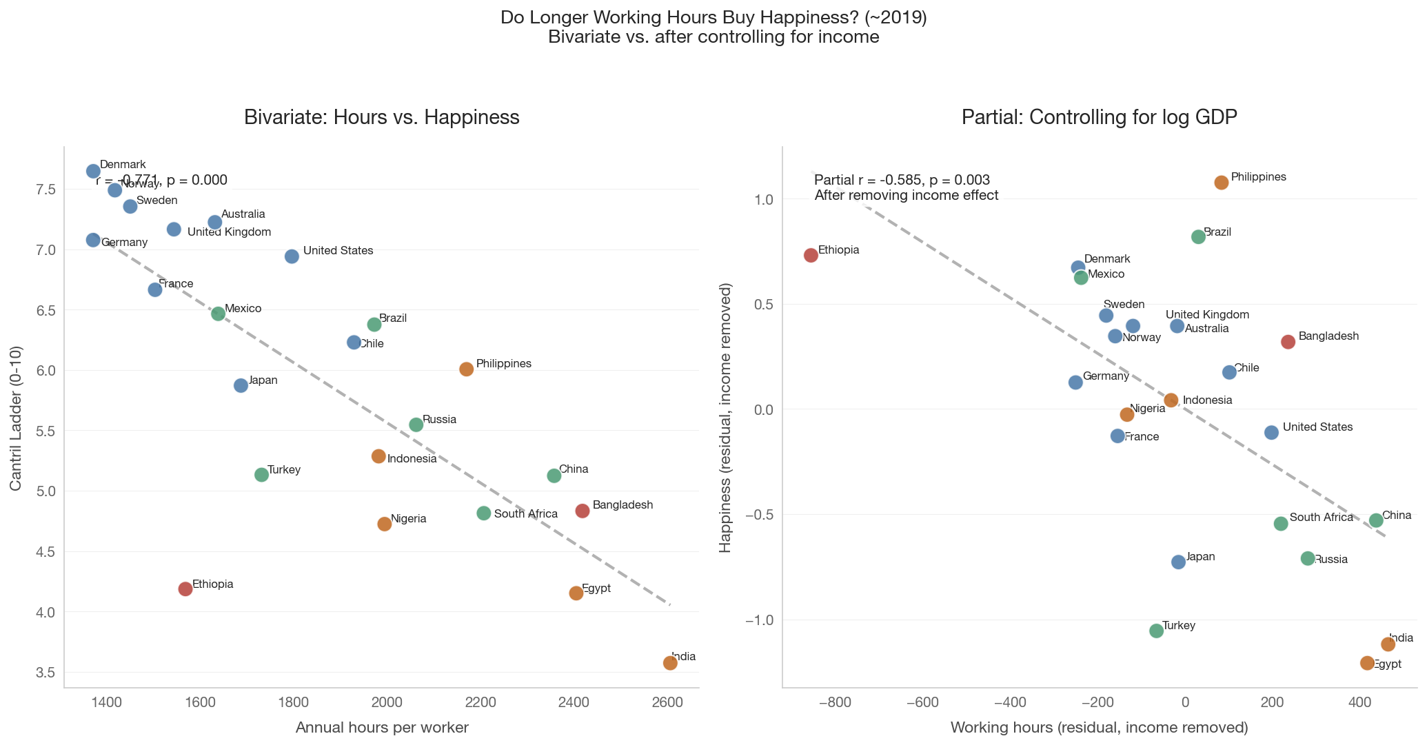
Does working more make people happier? Notebook 07 showed that absolute income is the strongest cross-sectional predictor of national happiness. But if extra working hours are how some countries achieve higher GDP, then the hours themselves may erode well-being through reduced leisure, increased stress, and diminished social capital.

The critical test is whether working hours have an independent effect on happiness after controlling for income — using the same residualization technique from Notebook 07.

Show code
if not hours_snap.empty:
    happiness = health_social.get_happiness_scores(year=2019)
    wb_data = health_social.get_wellbeing_data(year=2019)

    if not happiness.empty and not wb_data.empty:
        merged = (hours_snap
                  .merge(happiness, on='country_code', how='inner')
                  .merge(wb_data[['country_code', 'gdp_per_capita_ppp']],
                         on='country_code', how='inner'))
        merged = merged.dropna(subset=['happiness_score',
                                        'hours_per_worker',
                                        'gdp_per_capita_ppp'])

        fig, axes = plt.subplots(1, 2, figsize=(14, 7))

        # Panel 1: Bivariate
        ax = axes[0]
        colors = [tier_color(c) for c in merged['country_code']]
        ax.scatter(merged['hours_per_worker'], merged['happiness_score'],
                   c=colors, s=120, zorder=5, edgecolors='white',
                   linewidth=1, alpha=0.85)

        x_raw = merged['hours_per_worker'].values
        y_raw = merged['happiness_score'].values
        mask = np.isfinite(x_raw) & np.isfinite(y_raw)
        if mask.sum() > 3:
            sl, it, r, p, _ = stats.linregress(x_raw[mask], y_raw[mask])
            xf = np.linspace(x_raw[mask].min(), x_raw[mask].max(), 100)
            ax.plot(xf, it + sl * xf, color='gray', linestyle='--',
                    linewidth=2, alpha=0.6)
            ax.text(0.05, 0.95, f'r = {r:.3f}, p = {p:.3f}',
                    transform=ax.transAxes, fontsize=10, va='top',
                    bbox=dict(boxstyle='round', facecolor='white', alpha=0.8))

        annotate_countries(ax, x_raw, y_raw,
                           merged['country_code'].values, fontsize=8)
        ax.set_xlabel('Annual hours per worker')
        ax.set_ylabel('Cantril Ladder (0-10)')
        ax.set_title('Bivariate: Hours vs. Happiness')

        # Panel 2: Partial regression
        ax = axes[1]
        log_gdp = np.log(merged['gdp_per_capita_ppp'].values)
        full_mask = np.isfinite(x_raw) & np.isfinite(y_raw) & np.isfinite(log_gdp)

        if full_mask.sum() > 5:
            # Residualize hours on log GDP
            sl_xz, it_xz, _, _, _ = stats.linregress(
                log_gdp[full_mask], x_raw[full_mask])
            resid_hours = x_raw[full_mask] - (it_xz + sl_xz * log_gdp[full_mask])

            # Residualize happiness on log GDP
            sl_yz, it_yz, _, _, _ = stats.linregress(
                log_gdp[full_mask], y_raw[full_mask])
            resid_happy = y_raw[full_mask] - (it_yz + sl_yz * log_gdp[full_mask])

            colors_partial = [tier_color(c) for c in
                              merged['country_code'].values[full_mask]]
            ax.scatter(resid_hours, resid_happy,
                       c=colors_partial, s=120, zorder=5,
                       edgecolors='white', linewidth=1, alpha=0.85)

            sl_p, it_p, r_p, p_p, _ = stats.linregress(
                resid_hours, resid_happy)
            xf = np.linspace(resid_hours.min(), resid_hours.max(), 100)
            ax.plot(xf, it_p + sl_p * xf, color='gray', linestyle='--',
                    linewidth=2, alpha=0.6)
            ax.text(0.05, 0.95,
                    f'Partial r = {r_p:.3f}, p = {p_p:.3f}\n'
                    f'After removing income effect',
                    transform=ax.transAxes, fontsize=10, va='top',
                    bbox=dict(boxstyle='round', facecolor='white', alpha=0.8))

            annotate_countries(
                ax, resid_hours, resid_happy,
                merged['country_code'].values[full_mask], fontsize=8)

        ax.set_xlabel('Working hours (residual, income removed)')
        ax.set_ylabel('Happiness (residual, income removed)')
        ax.set_title('Partial: Controlling for log GDP')

        fig.suptitle('Do Longer Working Hours Buy Happiness? (~2019)\n'
                     'Bivariate vs. after controlling for income',
                     fontsize=13, y=1.03)
        plt.tight_layout()
        save_figure(fig, '09_hours_vs_happiness')
        plt.show()

        print(f'Bivariate: r = {r:.3f}, p = {p:.4f}')
        if full_mask.sum() > 5:
            print(f'Partial (controlling for log GDP): r = {r_p:.3f}, '
                  f'p = {p_p:.4f}')
    else:
        print('Happiness or GDP data not available.')
else:
    print('Working hours data not available.')

Bivariate: r = -0.771, p = 0.0000
Partial (controlling for log GDP): r = -0.585, p = 0.0034

7. Working Hours and Inequality

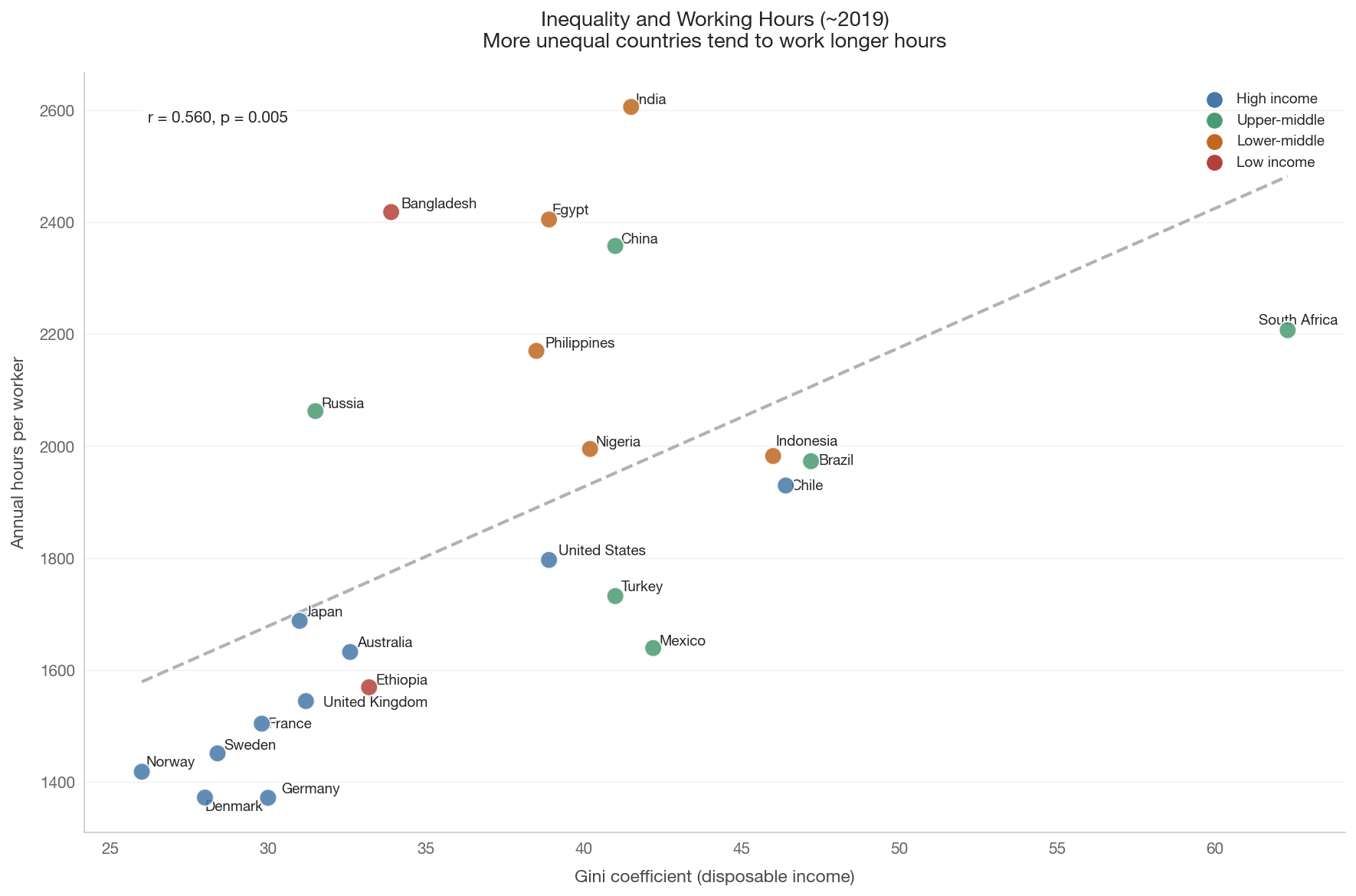
Alesina, Glaeser & Sacerdote (2005) argued that Europeans work less than Americans partly because of stronger labor market regulation (unions, mandated vacation, maximum-hours laws). More redistributive countries may also create less incentive to work long hours, because marginal tax rates are higher and public services reduce the need to earn.

Alternatively, higher inequality may force lower-income workers to work longer hours to maintain their living standards. Either way, we would expect a positive correlation between inequality and working hours.

Show code
if not hours_snap.empty:
    wb_data = health_social.get_wellbeing_data(year=2019)

    if not wb_data.empty and 'gini_disp' in wb_data.columns:
        merged = hours_snap.merge(
            wb_data[['country_code', 'gini_disp', 'gdp_per_capita_ppp']],
            on='country_code', how='inner')
        merged = merged.dropna(subset=['gini_disp', 'hours_per_worker'])

        if len(merged) >= 5:
            fig, ax = plt.subplots(figsize=(12, 8))
            colors = [tier_color(c) for c in merged['country_code']]
            ax.scatter(merged['gini_disp'], merged['hours_per_worker'],
                       c=colors, s=120, zorder=5, edgecolors='white',
                       linewidth=1, alpha=0.85)

            x = merged['gini_disp'].values
            y = merged['hours_per_worker'].values
            mask = np.isfinite(x) & np.isfinite(y)
            if mask.sum() > 3:
                sl, it, r, p, _ = stats.linregress(x[mask], y[mask])
                xf = np.linspace(x[mask].min(), x[mask].max(), 100)
                ax.plot(xf, it + sl * xf, color='gray', linestyle='--',
                        linewidth=2, alpha=0.6)
                ax.text(0.05, 0.95, f'r = {r:.3f}, p = {p:.3f}',
                        transform=ax.transAxes, fontsize=10, va='top',
                        bbox=dict(boxstyle='round', facecolor='white',
                                  alpha=0.8))
                print(f'Bivariate: Gini vs hours r = {r:.3f}, p = {p:.4f}')

            annotate_countries(ax, merged['gini_disp'].values,
                               merged['hours_per_worker'].values,
                               merged['country_code'].values)

            ax.set_xlabel('Gini coefficient (disposable income)')
            ax.set_ylabel('Annual hours per worker')
            ax.set_title('Inequality and Working Hours (~2019)\n'
                         'More unequal countries tend to work longer hours',
                         fontsize=13)

            for tier, color in TIER_COLORS.items():
                ax.scatter([], [], c=color, s=80, label=tier)
            ax.legend(loc='best', fontsize=9)

            plt.tight_layout()
            save_figure(fig, '09_hours_vs_gini')
            plt.show()
    else:
        print('Gini data not available.')
else:
    print('Working hours data not available.')
Bivariate: Gini vs hours r = 0.560, p = 0.0055

Show code
if not hours_snap.empty:
    wb_data = health_social.get_wellbeing_data(year=2019)
    if not wb_data.empty and 'gini_disp' in wb_data.columns:
        merged = hours_snap.merge(
            wb_data[['country_code', 'gini_disp', 'gdp_per_capita_ppp']],
            on='country_code', how='inner')
        merged = merged.dropna(subset=['gini_disp', 'hours_per_worker',
                                        'gdp_per_capita_ppp'])

        if len(merged) >= 8:
            hours = merged['hours_per_worker'].values
            gini = merged['gini_disp'].values
            log_gdp = np.log(merged['gdp_per_capita_ppp'].values)
            codes = merged['country_code'].values
            mask = np.isfinite(hours) & np.isfinite(gini) & np.isfinite(log_gdp)

            fig, axes = plt.subplots(1, 2, figsize=(14, 7))

            # Panel 1: Hours vs Gini, controlling for log GDP
            ax = axes[0]
            sl_xz, it_xz, _, _, _ = stats.linregress(log_gdp[mask], gini[mask])
            resid_gini = gini[mask] - (it_xz + sl_xz * log_gdp[mask])
            sl_yz, it_yz, _, _, _ = stats.linregress(log_gdp[mask], hours[mask])
            resid_hours_1 = hours[mask] - (it_yz + sl_yz * log_gdp[mask])

            colors = [tier_color(c) for c in codes[mask]]
            ax.scatter(resid_gini, resid_hours_1, c=colors, s=120, zorder=5,
                       edgecolors='white', linewidth=1, alpha=0.85)

            sl_p, it_p, r_p, p_p, _ = stats.linregress(resid_gini, resid_hours_1)
            xf = np.linspace(resid_gini.min(), resid_gini.max(), 100)
            ax.plot(xf, it_p + sl_p * xf, color='gray', linestyle='--',
                    linewidth=2, alpha=0.6)
            ax.text(0.05, 0.95, f'Partial r = {r_p:.3f}, p = {p_p:.3f}',
                    transform=ax.transAxes, fontsize=10, va='top',
                    bbox=dict(boxstyle='round', facecolor='white', alpha=0.8))

            annotate_countries(ax, resid_gini, resid_hours_1, codes[mask],
                               fontsize=7)
            ax.set_xlabel('Gini (residual, GDP removed)')
            ax.set_ylabel('Hours (residual, GDP removed)')
            ax.set_title('Inequality effect\n(controlling for income)')

            # Panel 2: Hours vs log GDP, controlling for Gini
            ax = axes[1]
            sl_xz2, it_xz2, _, _, _ = stats.linregress(gini[mask], log_gdp[mask])
            resid_lgdp = log_gdp[mask] - (it_xz2 + sl_xz2 * gini[mask])
            sl_yz2, it_yz2, _, _, _ = stats.linregress(gini[mask], hours[mask])
            resid_hours_2 = hours[mask] - (it_yz2 + sl_yz2 * gini[mask])

            ax.scatter(resid_lgdp, resid_hours_2, c=colors, s=120, zorder=5,
                       edgecolors='white', linewidth=1, alpha=0.85)

            sl_p2, it_p2, r_p2, p_p2, _ = stats.linregress(
                resid_lgdp, resid_hours_2)
            xf = np.linspace(resid_lgdp.min(), resid_lgdp.max(), 100)
            ax.plot(xf, it_p2 + sl_p2 * xf, color='gray', linestyle='--',
                    linewidth=2, alpha=0.6)
            ax.text(0.05, 0.95, f'Partial r = {r_p2:.3f}, p = {p_p2:.3f}',
                    transform=ax.transAxes, fontsize=10, va='top',
                    bbox=dict(boxstyle='round', facecolor='white', alpha=0.8))

            annotate_countries(ax, resid_lgdp, resid_hours_2, codes[mask],
                               fontsize=7)
            ax.set_xlabel('Log GDP (residual, Gini removed)')
            ax.set_ylabel('Hours (residual, Gini removed)')
            ax.set_title('Income effect\n(controlling for inequality)')

            fig.suptitle('Disentangling Inequality and Income Effects on Working Hours',
                         fontsize=13, y=1.03)
            plt.tight_layout()
            save_figure(fig, '09_hours_gini_gdp_multivariable')
            plt.show()

            print(f'Partial r (hours vs Gini | GDP): {r_p:.3f}, p = {p_p:.4f}')
            print(f'Partial r (hours vs GDP | Gini): {r_p2:.3f}, p = {p_p2:.4f}')
        else:
            print(f'Only {len(merged)} countries with all three variables.')
    else:
        print('Gini data not available.')
else:
    print('Working hours data not available.')

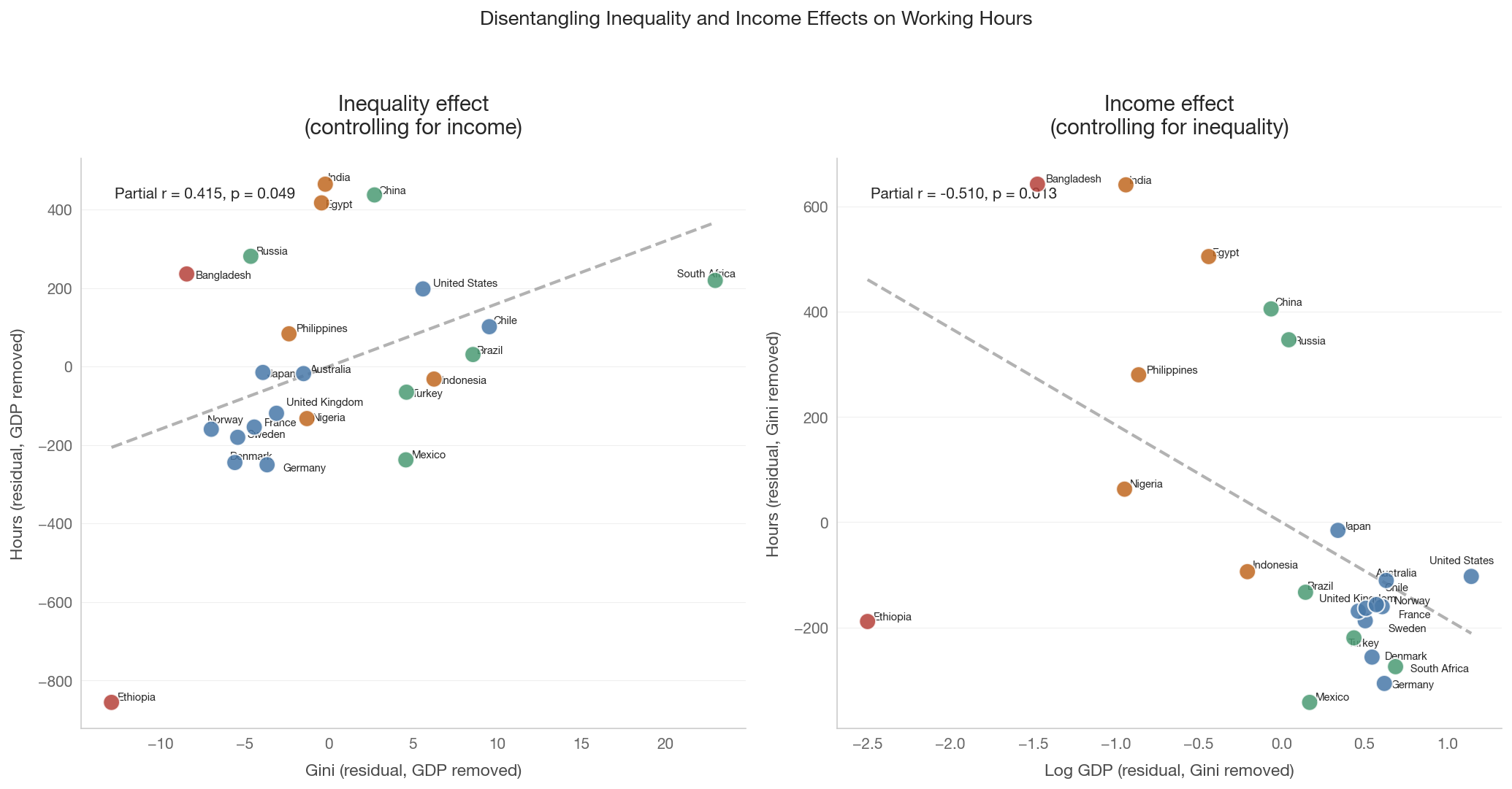
Partial r (hours vs Gini | GDP): 0.415, p = 0.0491
Partial r (hours vs GDP | Gini): -0.510, p = 0.0129

8. Key Takeaways

The great hours decline

Working hours have fallen dramatically over 150 years. In 1870, workers in industrialized countries averaged 2,500-3,000+ hours per year. By 2019, the range was 1,300-1,800 in most rich countries. This is one of the largest improvements in quality of life delivered by economic development — yet it rarely features in discussions of inequality or progress.

The US-Europe divergence

Until the 1970s-1980s, American and European working hours tracked together. Then they diverged: European hours continued falling (driven by union bargaining, mandated vacation, and shorter workweeks), while US hours plateaued or even rose. Today, Americans work 200-400 more hours per year than Northern Europeans — equivalent to 5-10 extra workweeks annually.

This divergence is not primarily about different preferences. Alesina, Glaeser & Sacerdote (2005) argue it reflects different labor market institutions and political choices. Prescott (2004) points to differences in marginal tax rates.

Hours, productivity, and the American trade-off

Countries with shorter working hours often achieve higher output per hour. The US achieves high GDP per capita partly through longer hours, not just higher productivity. This represents a specific societal choice: Americans trade leisure for GDP.

Connecting to the Easterlin Paradox

Notebook 08 found that countries which grew richer over time did not clearly grow happier. This notebook adds a potential mechanism: if extra GDP growth comes partly from extra working hours, the cost is less leisure without a corresponding happiness payoff. The US is the canonical example — richer than most European peers in GDP per capita, but not in GDP per hour, and no happier.

Working hours and inequality

More unequal countries tend to have longer working hours. This could reflect: - Institutional channels: Countries with weaker unions and less regulation have both higher inequality and longer hours. - Compulsion: In unequal countries, lower-income workers may need to work longer to maintain living standards. - Tax incentives: Lower marginal tax rates (associated with less redistribution) make additional hours of work more financially rewarding.

Data limitations

  • Averages mask variation: Economy-wide average hours per worker obscures the gap between full-time and part-time workers, formal and informal sectors, and different occupations.
  • Historical data is selective: Pre-1950 data from Huberman & Minns measures full-time production workers in non-agricultural activities, not the full economy.
  • Informal work: In developing countries, labor force participation rates undercount informal work — especially women’s unpaid domestic labor. Cross-country comparisons must be interpreted cautiously.
  • Approximate productivity: GDP per hour is approximated from GDP per capita, participation rates, and hours per worker. OECD provides more precise data for member countries.
  • Small N: With ~20 countries, cross-sectional correlations have limited statistical power and can be driven by outliers.