# --- Visualization: added-variable (partial regression) plots ---
# These show the relationship between each predictor and happiness
# AFTER removing the effect of the other predictor.

if (not wb_happy.empty
        and 'gdp_per_capita_ppp' in wb_happy.columns
        and 'gini_disp' in wb_happy.columns
        and 'happiness_score' in wb_happy.columns):

    df = wb_happy.dropna(subset=['gdp_per_capita_ppp', 'gini_disp', 'happiness_score'])

    fig, axes = plt.subplots(1, 2, figsize=(14, 6))

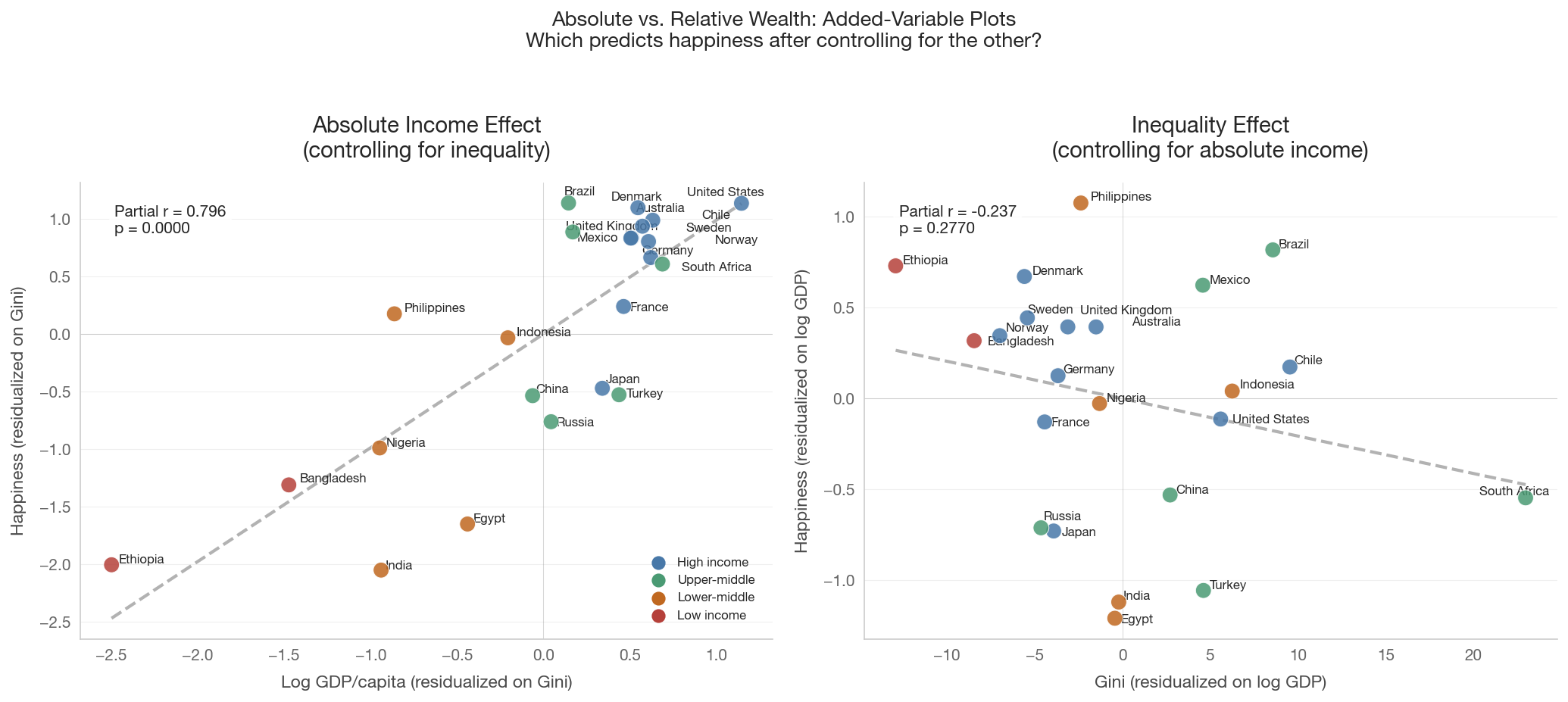
    # Panel 1: GDP effect (controlling for Gini)
    ax = axes[0]
    colors = [tier_color(c) for c in df['country_code']]
    ax.scatter(gdp_resid, happy_resid_gini, c=colors, s=100, zorder=5,
               edgecolors='white', linewidth=0.5, alpha=0.85)

    # Fit line on residuals
    m1 = np.isfinite(gdp_resid) & np.isfinite(happy_resid_gini)
    if m1.sum() > 3:
        sl, it, r, p, _ = stats.linregress(gdp_resid[m1], happy_resid_gini[m1])
        xf = np.linspace(gdp_resid[m1].min(), gdp_resid[m1].max(), 100)
        ax.plot(xf, it + sl * xf, color='gray', linestyle='--', linewidth=2, alpha=0.6)
        ax.text(0.05, 0.95, f'Partial r = {r:.3f}\np = {p:.4f}',
                transform=ax.transAxes, fontsize=10, va='top',
                bbox=dict(boxstyle='round', facecolor='white', alpha=0.8))

    annotate_countries(ax, gdp_resid, happy_resid_gini,
                       df['country_code'].values, fontsize=8)
    ax.set_xlabel('Log GDP/capita (residualized on Gini)')
    ax.set_ylabel('Happiness (residualized on Gini)')
    ax.set_title('Absolute Income Effect\n(controlling for inequality)')
    ax.axhline(0, color='gray', alpha=0.3, linewidth=0.5)
    ax.axvline(0, color='gray', alpha=0.3, linewidth=0.5)

    # Panel 2: Gini effect (controlling for GDP)
    ax = axes[1]
    ax.scatter(gini_resid, happy_resid_gdp, c=colors, s=100, zorder=5,
               edgecolors='white', linewidth=0.5, alpha=0.85)

    m2 = np.isfinite(gini_resid) & np.isfinite(happy_resid_gdp)
    if m2.sum() > 3:
        sl, it, r, p, _ = stats.linregress(gini_resid[m2], happy_resid_gdp[m2])
        xf = np.linspace(gini_resid[m2].min(), gini_resid[m2].max(), 100)
        ax.plot(xf, it + sl * xf, color='gray', linestyle='--', linewidth=2, alpha=0.6)
        ax.text(0.05, 0.95, f'Partial r = {r:.3f}\np = {p:.4f}',
                transform=ax.transAxes, fontsize=10, va='top',
                bbox=dict(boxstyle='round', facecolor='white', alpha=0.8))

    annotate_countries(ax, gini_resid, happy_resid_gdp,
                       df['country_code'].values, fontsize=8)
    ax.set_xlabel('Gini (residualized on log GDP)')
    ax.set_ylabel('Happiness (residualized on log GDP)')
    ax.set_title('Inequality Effect\n(controlling for absolute income)')
    ax.axhline(0, color='gray', alpha=0.3, linewidth=0.5)
    ax.axvline(0, color='gray', alpha=0.3, linewidth=0.5)

    # Tier legend
    for tier, color in TIER_COLORS.items():
        axes[0].scatter([], [], c=color, s=60, label=tier)
    axes[0].legend(loc='lower right', fontsize=8)

    fig.suptitle('Absolute vs. Relative Wealth: Added-Variable Plots\n'
                 'Which predicts happiness after controlling for the other?',
                 fontsize=13, y=1.03)
    plt.tight_layout()
    save_figure(fig, '07_absolute_vs_relative_happiness')
    plt.show()
else:
    print('Data not available for partial regression plots.')